Contextualizing Information with Data Visualization
The world as we know it largely revolves around data. Observing behavior, trends, correlation, and all kinds of information can offer extremely valuable insight into nearly any industry. But without the concept of data visualization, at best we would be left with all this data in endless rows and columns, difficult for the human eye to digest in a large set and impossible to compare and contrast. Data visualization is the picture we paint in order to be able to interpret the information. It allows us to look at all the data we have gathered and draw meaningful conclusions. The ability to bring context to a dataset is critical, but even more so is the ability to represent that context in the most accurate and most effective way possible.
For example, let’s imagine we have three groups, a red team, a green team, and a blue team, and we want to represent the percentage of people on each team who feel that cats are superior to dogs (shouldn’t we all agree on that?). Take a look at Chart #1:
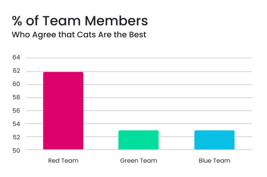
At a glance, the disparity between members of the red team who prefer cats versus the other two teams appears significant. Now let’s look at the same data represented another way:
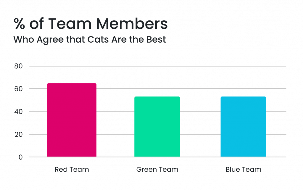
By increasing the scale of the y-axis to increments of 20% instead of 2%, suddenly it doesn’t feel as if the three teams are very far off from one another after all. Subtle adjustments like this can have a big impact when it comes to interpreting data, and at worst can even be misleading. Common mistakes include improper use of color contrast making differences in value appear greater than they are, or overcrowding a chart with too much data. It’s important to keep some basic principles in mind when we want to represent information.
Who Is Your Audience?
You probably wouldn’t present the same charts to a meeting of investors as you would to a class of middle school students. The level of detail that might be of interest, the information already available, the amount of time for study and many other variables will be different from one audience to another, so we have to keep this in mind when choosing visuals in order to get the point across most effectively. Try to direct an audience’s attention to important details that will be of most interest to them, or include short narratives for those who might be lacking context. Think about whether they might want to use interactive filters on a chart to focus on specific data (common with finance and trading). The goal is to make the data as engaging as possible.
Choose The Right Chart For The Job
Chart types will make or break the story you want your data to tell. Think about why and how your data was collected. How large is your dataset? Is it mostly numbers, or some other data type? There are a few general rules of thumb, such as tables are often good for displaying price values and graphs are useful to represent patterns and relationships over time. But thinking about the point you’re trying to convey will make the choice easier. Let’s imagine another basic example, where we want to display which flavor of ice cream received the most votes:
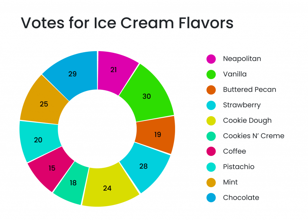
We often think of pie charts as representative of parts of a whole, but here the numbers don’t appear to add up to any meaningful total number in particular. The data points are within a relatively close range of one another, and it’s not very apparent when we glance at this chart that the most popular flavor choice, vanilla, received twice as many votes as pistachio, the least popular. A bar graph would probably be a better choice here to show us which flavors received the most votes. If we had started out by saying that for some reason our goal was to see how many out of a specific group of 229 people were interested in each different flavor, then we may have more of a case for the pie chart.
There are so many unique types of charts and ways to represent data that can be a lot of fun to play around with. Here are a few good ones:
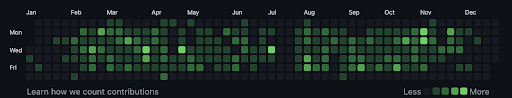
Heat maps use a dark-to-light color scale to show the frequency or intensity of something. A lot of us are familiar with this one from GitHub that plots your activity over time:
3D charts can also be very useful with the right data, in addition to adding a bit of “wow factor” to a project. Here, we have a 3D cluster where each node represents a digital wallet. The cluster shows us the relationship between the wallet in the center (the purple dot) and all the wallets it has interacted with, and the size of each node correlates to the value of that wallet.
![]()
It’s also important to note that charts and graphs are not the only form of data visualization. Take a look at this example:
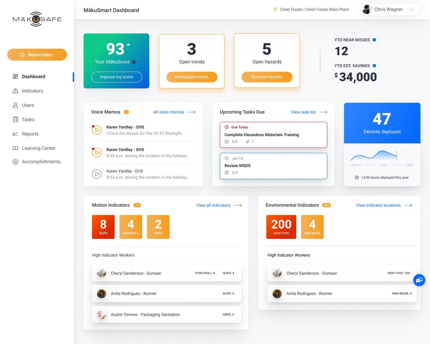
This dashboard used to contain lots of graphs and charts, making assumptions about what users wanted to see when in reality they felt overwhelmed by the way the information was presented. Here, it’s been redesigned to highlight the data in a more digestible way. The team determined the most important and impactful safety metrics and put those at the top/largest in the hierarchy, with the rest of the modules adding summary information that is used as launching points to explore the rest of the data. We’re left with a really nice interface that tells us everything we need to know in one quick glance.
Choosing the best way to display data is key, and there are few things as satisfying as a well-designed chart or layout!
Accessibility
Accessibility in design is often overlooked but making this a priority really benefits everyone. Many features that are helpful for assistive technology such as additional summary and clear axis labels with human-readable words can enhance the visuals overall. Using patterns rather than just colors as indicators can highlight contrasting values while making the content more accessible. Labeling data points directly makes a graph quicker to read and also decreases reliance on color. When adding data filters, consider using dropdowns that can be used by screen readers rather than sliders when possible.
Conclusion
Data visualization gives us critical insights into the information that the human brain couldn’t otherwise make sense of. If used effectively, it can be a very powerful tool. When you’ve put effort into collecting and modeling data for your project, it deserves carefully crafted visualization to explore, interpret, and present your results.
Make your data work for you.